
Each one of us remembers our Geography class in school. How we used to identify the countries, memorising their shapes and comparing them with other. But did you know, the map that you are used to might be wrong?
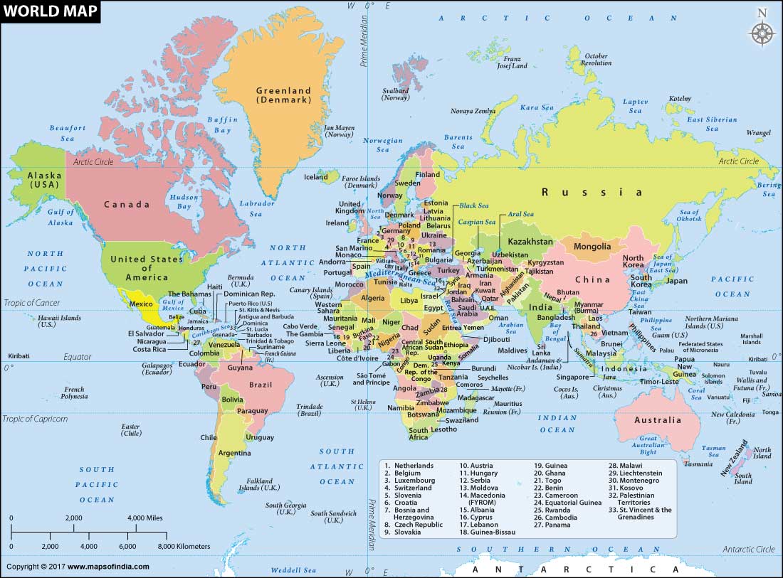
If you have seen the world map and thought that Greenland is almost same size as Africa, you are horribly wrong. Africa is actually 15 times bigger than Greenland. You read it right, Africa is 15 times bigger than Iceland. Now let’s see why and how is this so.
In fact, the maps in our heads share the same errors, some of which are quite large. For instance, we all know that South America is south of North America. But you may be surprised by the fact that virtually the entire South American continent is east of Florida.
Though we see around two-thirds of African continent north of the equator, which is correct, North Americans see Africa as entirely in the southern hemisphere, similar to South America.
The continent of Europe is also often placed much farther south on mental maps than it really is, appearing directly across the Atlantic from the United States. But it actually lines up better with Canada: Paris is further north than Montreal, Barcelona is on a similar latitude as Chicago and Venice lines up with Portland, Oregon.
Misconceptions about size
Locations aren’t the errors; we also have misconceptions about the relative size of countries.
When you look at the map, you’ll likely see that North America is larger than Africa, Alaska is larger than Mexico and China is smaller than Greenland. But in reality China is four times bigger than Greenland, Africa is three times bigger than North America and Mexico is larger than Alaska.
The map also suggests that Scandinavian countries are larger than India, whereas in reality India is three times the size of all Scandinavian countries put together.
Why does this happen
One can blame the nature of two-dimensional maps for this as flattening a three-dimensional globe onto a flat surface isn’t possible without some distortion. The distortion is the result of the Mercator projection, the map most commonly seen hanging in classrooms and in text books, which was created in 1596 to help sailors navigate the world.
Mercator maps distort the shape and relative size of continents, particularly near the poles. This is why Greenland appears to be similar in size to all of South America on Mercator maps, when in fact South America is more than eight times larger than Greenland.
There are some other surprising inconsistencies too, such as: Brazil in reality is bigger than the entire contiguous United States and almost as large as Canada. And Alaska, which appears as giant on Mercator maps, is actually a little smaller than Libya.
According to critics, another argument for this distorted map is that it represented Euro centricity and historic colonialism.
Even the advent of satellite imagery and tools such as Google maps has not improved our view of the world and much of this is due to technical reasons.
The biggest challenge of portraying the spherical world on a flat map has haunted cartographers for centuries. As a result, shapes of world maps have typically been diverse, ranging from hearts to cones.
Where to see the actual map
If you want to see the comparison between the Mercator map and the actual size of the countries, you can check out a GIF released by climate data scientist Neil Kaye that demonstrates the issue. The animation quite effectively shows just how enlarged certain landmasses appear in the Mercator projection, particularly as you move away from the equator.